Maps are territories: they give away the mentalities, ideologies of their (map)makers. Using the web-image search engines or library resources, locate a curious map of the Middle East and write a paragraph about it. This can be a contemporary map, a sattelite image, a historical map, a city plan etc. anything that is some form of a cartographic representation of the Middle East or a part of it. The goal is to challenge the idea of a map as a representation of a geographical reality. Post your map and your paragraph below. Please make sure that your image size do not exceed 700 pixels in width and provide an image credit (reference to the source of your image).
Due: January 30, Wednesday: to be posted on this page below.
Posted at Jan 27/2008 06:12PM:
Gareth: Image source: http://www.globalresearch.ca/index.php?context=viewArticle&code=CHO20060726&articleId=2824
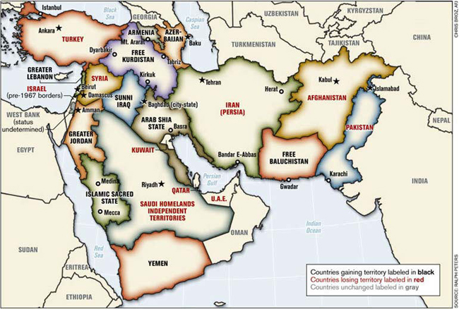
This image (drawn up by a retired military Colonel, Ralph Peters) was originally posted on the American Armed Forces website. It is a completely fictional and not even, as of yet, a serious proposal. This image is representative of both the geographical and political situations in the "Middle East," highlighting the outside influence of the rest of the world. The history of this region tells us that the borders of the countries were mainly drawn up by foreign, sometimes colonial, powers––Iraq itself was created in the uniting of three independent and rival states, and the Sunnis (at that time a minority) were put in charge. That questionable formation is mirrored by this map's seemingly ridiculous 'proposals,' and the region's confused and violent past and present can be seen in the various shifts in borders that are simply attempts to make all parties (or at least the one’s deemed important) happy. The map was presented at a NATO gathering and met with animosity, particularly from the present Turkish officers (http://www.todayszaman.com/tz-web/detaylar.do?load=detay&link=36919). Most importantly, the map expresses the Colonel’s ideals regarding the “Middle East,” namely that the outside world should still be in charge of its shaping.
Posted at Jan 29/2008 10:12AM:
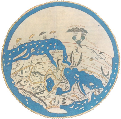
carrie: Image source: About.com (http://historymedren.about.com/library/atlas/blatmapworld1154.htm)
This 12th century map shows the “Middle East,” Africa, and some parts of Central/Eastern Asia and Europe. It was produced ca. 1154 CE by the Moroccan scholar Muhammad al-Idrisi (who lived 1100-1166 CE) for his patron, King Roger II of Sicily. This map fascinates me because in our Western education we are conditioned to view the map in a specific manner, with north at the top; here, south is at the top of the map (can you guys pick out the Arabian Peninsula, Nile River, Indian Ocean, Persian Gulf, and the Mediterranean?). The center of the Muslim world (Mecca, Medina, and Jerusalem) is perceived and portrayed as literally being the center of the world. The main features of the map are rivers, islands, seas, mountain ranges, and trade routes; also of note is the huge size of Africa (especially the north coast… including Morocco) in comparison to the other lands. Al-Idrisi was highly experienced as a traveler and very well-educated as a geographer and cartographer. It is thus interesting to view this map in light of al-Idrisi’s religion (Islam), his background (raised in the Almoravid caliphate of the Maghrib), his purpose (producing information for a Norman ruler living in an island kingdom in southern Europe), and the historical circumstances (Second Crusade against the Byzantine Empire).
Posted at Jan 29/2008 04:19PM:
Anjana: Image Source: The New York Times http://www.nytimes.com/imagepages/2006/07/23/weekinreview/20060723_MIDEAST_GRAPHIC.html
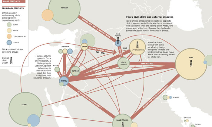
This image was taken from the New York Times July 23, 2006 issue. It depicts the modern Middle East as a crisscross of major and secondary conflicts and attempts to outline the various ethnic groups in each country. This map is interesting to me because I think it says something of the way that much of the Western world views the Middle East, in terms of barbaric, belligerent ethnic groups and its strategic and personal interest in the region’s resources. Especially noteworthy are the broad “Other Muslim” category and inclusion of which players have control of oil in the region; these inclusions attest to the idea that Westerners wish to be involved in the region only in a minimal sense, to be able to identify the major players in the region and assure that their own interests are protected. The mini-article that accompanies the map (which had to be cropped due to size restriction) speaks of the impossibly complicated conflict in the Middle East, alluding to the idea that conflict always was, is and always will be the mindset of the people. In other words, stability is not possible in the region because each country is irrevocably in conflict with the others.
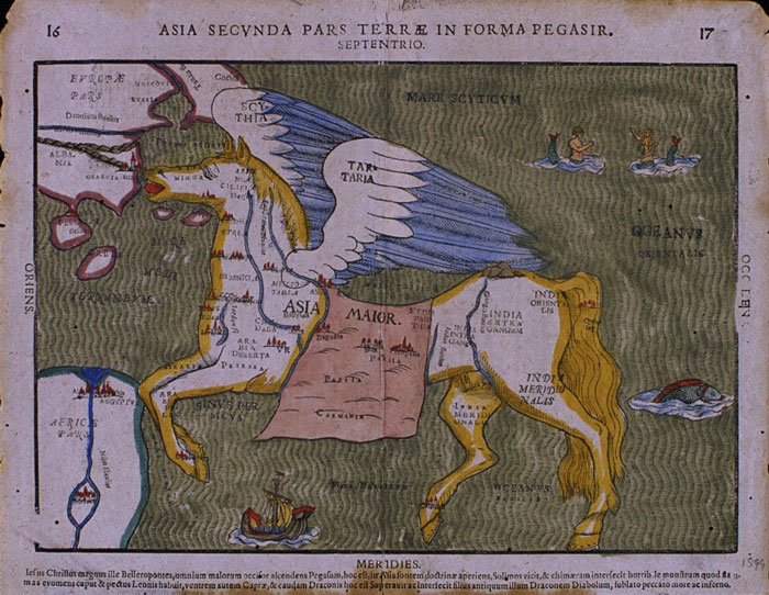
Posted at Jan 29/2008 09:09PM:
Megan: Image Source: Yale University Library (http://www.library.yale.edu/MapColl/oldsite/map/pegasus.GIF)
This is a really dark copy of Heinrich Bunting’s 1594 “Map of Asia in the shape of a winged horse.” The map is a fanciful depiction of Asia that highlights the artistic possibilities of mapmaking, albeit while sacrificing some of the accuracy. Anatolia is located in the horse’s head, while Syria, Phoenicia, and Jerusalem appear to hug the Mediterranean coast fairly closely. The Arabian peninsula is shrunken down to fit into the horse’s forelegs, and the saddle blanket contains most of Persia, in a dramatic stretching out of the territory. India is the entire hindquarters of the horse, while China appears to have been completely left off of the map. I love the way this map challenges the idea of geographic representation, and pushes the continent of Asia into a form Bunting thought suited it, without apparent thought to actual distances or reality. You could not travel with this map, but it was found in a book called “Itinerarium Sacrae Scipturae,” intended as a guide to the Holy Land for 16th century German travelers. The map highlights the idea of the West’s misperceptions of the Eastern world, and the way it changes the form of the land to suit its own desires or historical projections.
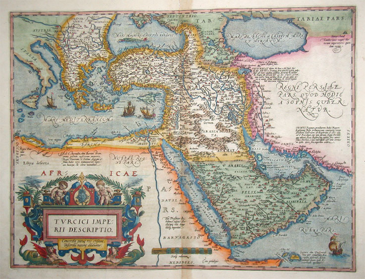
Posted at Jan 29/2008 09:14PM:
Jenna: Image Source
This 16th century map of the Middle East depicts the Turkish Empire, including the Arabian Peninsula, in addition to its neighboring countries. The original copper engraving of this fine, hand-colored antique map, first published in 1598 in Antwerp, Belgium in the atlas Thetrum Orbis Terrarum, can be purchased online for just a little over 1,000 Euros. As the map was created by a European, it projects a biased view of the Middle Eastern region. Ships are shown floating in the sea, which likely belong to Belgium, the homeland of the cartographer. By including their own ships in the Middle Eastern waters, the cartographer stresses that his nation has discovered this foreign land. At the time of the map’s creation, Antwerp was considered to be one of the economic centers of Europe, and the hub of international trade and exploration. Thus, this map might have been created to depict the territory of the Middle East, ripe for exploration and trade relationships.
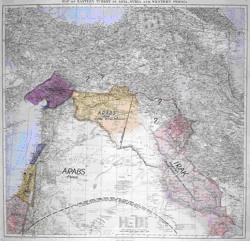
Posted at Jan 29/2008 10:13PM:
Benjamin: This map is displayed at the British Imperial War museum. It was drawn up by T E Lawrence; also know as “Lawrence of Arabia”, a British soldier who fought along side Arab troops in World War 1. The map was presented to the British cabinet in 1918 demonstrating a way of separating territories in the Middle East. Lawrence’s knowledge of the area meant that he took into account feelings of people in the Middle East more than the European colonials did at the time. Lawrence included a separate state for the Kurds, and grouped together Syria, Jordan and areas of Saudi Arabia. Also included is Palestine, where Israel is today. The fact that Lawrence drew up the map demonstrates the attitude long held towards the region in the west that it is our job to organize the area. This is seen today with attempts by the USA to police the region.
Posted at Jan 29/2008 10:15PM:
Benjamin: image source.
Posted at Jan 30/2008 12:21AM:
Ashley: The layered map is no new invention. We have perhaps all handled maps over which transparencies may be imposed individually or together to allow patterns or sequences to be emphasized or juxtaposed for analytical purposes. The computer age takes this convention to new, more graphic and more interactive heights. Coupled with the internet dissemination becomes almost a non-issue. The issues that do arise (and one of the reasons I chose this map) surround the information that contextualizes the map as it is presented online, everything from the name of the site to the map’s caption. This link http://www.mapsofwar.com/ind/imperial-history.html is to a Macromedia map entitled “Imperial History of the Middle East”. The site notably is called MAPS OF WAR. We see a map of the Middle East with land and borders colored in shades of gray and bodies of water in blue. The colors used in the map reinforce what we know from its title, that topography is not the major concern of this particular map, but, this may also be considered a constraint of technology. The map sits over a timeline along which an indicator moves. The scope of the timeline is 3000 B.C. E. to 2006 (when the site was created). As the timeline indicator advances different colors appear over areas of the Middle East with the title of the relevant Imperial Entity or Nation. The color that indicates one empire disappears only after that which indicates the next has completely been shaded in, thus allowing us to see the overlap in the territory of each successive empire, and the vastness of one in relation to the previous one. The caption which accompanies the map is as follows:
“Who has controlled the Middle East over the course of history? Pretty much everyone. Egyptians, Turks, Jews, Romans, Arabs, Persians, Europeans...the list goes on. Who will control the Middle East today? That is a much bigger question.”
The caption adds a touch of drama to an otherwise straightforward and more or less factual map. The map maker could not have made his motive clearer; although the information the map itself gives us, is primarily of a historical nature, the creators concern and reason for creating it lies more in present and future realities of the region.
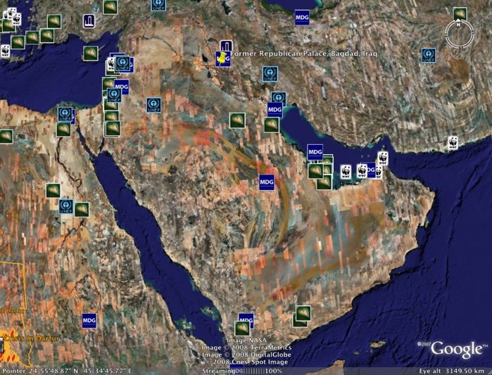
Posted at Jan 30/2008 12:24AM:
Kelly: This is a screen shot taken from the popular free program Google Earth. I originally wanted a map of the Middle East that showed no borders and just focused on the land mass so that I could look at the geographical features of the region without the imposed borders. One of the features that I really like about this screen shot is the patchwork quilt quality of the image. It emphasizes the fact that each pictures was taken at a specific moment in time, and all have been woven together to form a cohesive map. The interactive quality of Google Earth allows any given person to cater a map to their own interests. Our mental maps can be more easily tied to a physical map to enhance understanding of a region. In the photo the Global Awareness Layer is showing. This layer pinpoints the various humanitarian efforts taking place in the Middle East. Clicking on the icons reveals a summary of the organization and project while also providing links where the viewer can get more information. In this way, Google has created a sort of living map that shifts depending on current human actions and events.
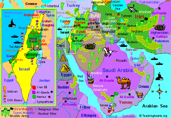
Posted at Jan 30/2008 09:26AM:
Sheetal: Title (that didn't show up): Israel and Armageddon
It’s interesting to think about who this map was made for. The images include cartoonish pyramids and camels as well as more menacing tanks, fighter jets, battle ships and armies. The map depicts hostile relations between one state in the Middle East and all the rest. The direction of the arrows are not pointing out the flow of the rivers. The mapmakers are conveying a political/social “reality”, one which to them proves the impending fulfillment of a prophecy stating that the Jewish people will be forced to abandon their “wrong beliefs” and be reincorporated into the Church. It’s amazing just how much meaning is infused into this single map beyond the ‘geographic realities’ of the area.
This map is interesting on its own but is even more interesting when seen as one of a series of thirty maps attempting to recreate the progression of history/the Church (which are slowly conflated), through the ages, all the way back to Pangea.
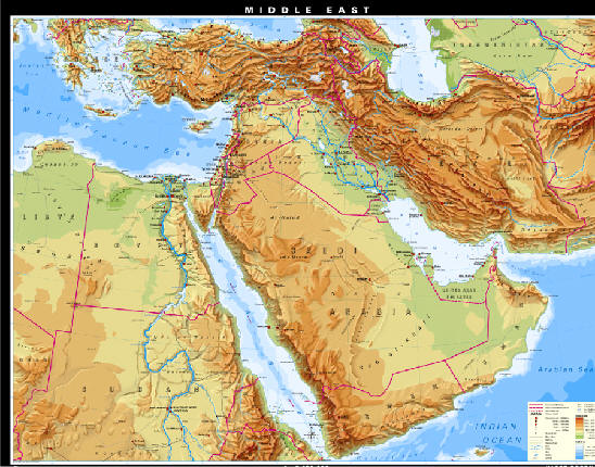
Posted at Jan 29/2008 11:10PM:
vanessa: I like this map for many reasons. Firstly, I like the topigraphical aspect of the map and what is reveals about the area. By being able to see where the more mountainous areas are vs. the more flat, desert areas shows more about the culture and climate of each country. I like how the borders between each country are clearly defined, often in relation to the natural topography of the landscape. Secondly, I appreciate how surrounding countries such as, Greece and Russia are shown to give a spatial reference on a global scale. We are able to see parts of Africa, Europe and Asia with all bodies of water labeled. Thirdly, I like the amount of labeling that is done within each country. All of the capitals and major cities are marked as well as significant landmarks. This map shows a lot about this region of the world, while not making it confusing and unreadable. I think that this map is approachable and informative. It shows cultural connectivity and divide and allows for a better understanding of the region and its relationship to surrounding areas.
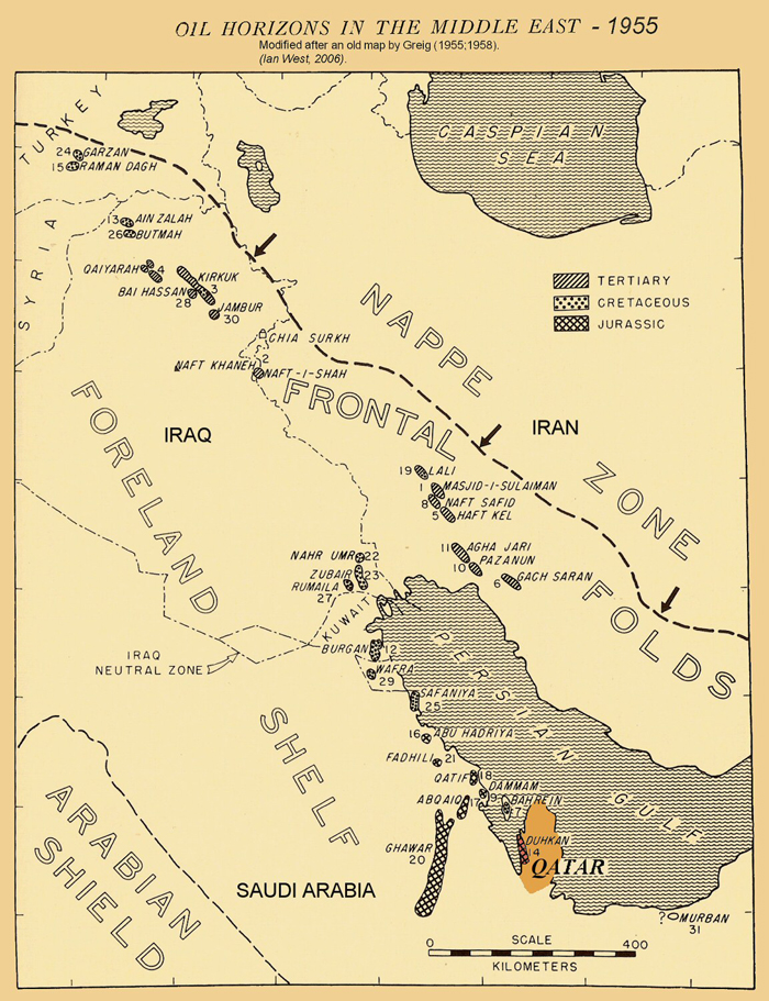
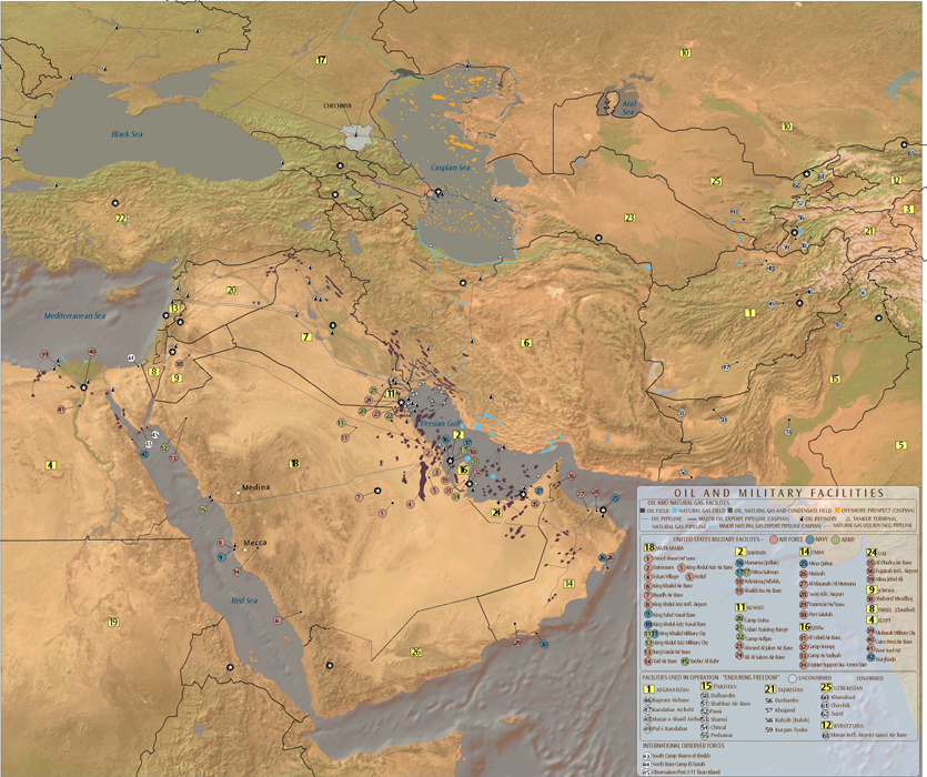
oliver: This map attracted my attention because it is largely responsible for our understanding of the region today. The distribution of oil in Persia, the Levant, and Arabian peninsula has given us the state boarders, conflicts and understanding we have of the region today, and that profoundly effects how the archeology and histories of the region are examined. The invasion of Iraq in 2003 fr example has lead to massive looting of Babylonian and Sumarian artifacts and made archeological study in the area impossible. If the oil in this 1955 map had not been charted, it can easily be argued that our archeological and historical understanding of the region would be much richer and detailed than it is today.
Rosalie: This map interests me because it highlights a specific aspect of contemporary international politics, and because oil and military initiatives are two highly popular associations with the Middle East as conceived by the West. An organization called the Global Education Project created this map from a collection of other maps, and this map is included in “The Middle East – An Educational Wall Poster,” an “impartial, non-partisan educational reference” which is “helpful for people of all ages, religions, and political persuasions.” I’m interested in the map itself, with all the detail it contains and the choice of positions for the military bases, but also in the decisions the mapmaker(s) made in pairing a map of U.S. military presence with a map of oil resources, in denoting which bases have been used in Operation Enduring Freedom, and in including the presence of International Observer Forces. I do not think it is an impartial reference, but it’s interesting to me in general what information classifies as “educational,” and what information is deemed important to include in (or sells as) comprehensive regional educational material. Their other projects besides “The Middle East” include “Earth” and “Ancient Egypt”. I would say GEP is pretty talented at data organization and visual representation.
http://www.theglobaleducationproject.org/mideast/info/maps/middle-east-military-and-oil-map.html