
The users of your website don’t have a lot of patience — they expect your webpages to be organized in a way that makes sense to them. A user-centric structure for your webpages helps people find the information they need quickly and easily.
Understanding Information Architecture
The structure, or organization, of your website is called information architecture (IA). The IA is a site map in an outline form.
View a sample information architecture in Google Docs
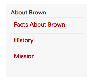
The navigation (or menu) on your website follows the IA. So an IA that looks like this:
-
About Brown
- 1.1 Facts About Brown
- 1.2 History
- 1.3 Mission
Creates this menu on a webpage:
Developing Information Architecture
As you develop the IA, you are deciding how all of your webpages will fit into the structure. The IA sets the order, can establish the priority of certain information over other less important information and may repeat items that make sense in two places.
- Send a message about priority and importance. For example:
-
1. Apply
- 1.1 Admission Requirements
- 1.2 Application Deadlines
- 1.3 Tips
- 1.4 Get Help
-
- Use alphabetic lists for ease of use and when you don’t want to imply priority. For example:
-
1. Club Sports
- 1.1 Cycling
- 1.2 Golf
- 1.3 Skiing
- 1.4 Tennis
-
- When necessary, a webpage can appear in two places in the IA. But don’t overdo this! (Note: There is only one version of the webpage and the second location in the IA is actually a link to that original version.) The example below demonstrates this with Anthropology:
-
1. Degree Programs
- 1.1 A to Z List
- 1.1.1 Africana Studies
- 1.1.2 American Studies
- 1.1.3 Anthropology
- 1.2 Humanities
- 1.3 Life Sciences
- 1.4 Social Sciences
- 1.4.1Anthropology (link to 1.1.3.)
- 1.1 A to Z List
-
Categories and Page Names
When you draft an information architecture you also will create groups and sort all of the information on your website into those groups. For example, you may need a group that covers webpages for parking information, addresses, phone numbers and directions to campus. With a "Contact Us" group, the IA could look like this:
- Contact Us (this page includes office location and mailing address)
- 1.1 Faculty and Staff Directory
- 1.2 Directions
- 1.3 Parking
The fewer groups, the better. Your website is easier to use when there are just a few options. When users have more choices, it requires more effort and potentially creates confusion. Confused users may give up in frustration. A caution: Use judgment when combining groups. "Housing and Dining" makes sense as a group but "News and Parking" does not.
Use simple and clear language for your groups, taking advantage of conventions that users look for and expect to see.
The group or page name in your menu should be nearly identical to the title of the webpage you’ll land on when you click it. For example, if the menu item is "Admission Requirements," the page title should be "Admission Requirements," not "Understanding the Admission Process at Brown."
What to Avoid
- Don’t create an information architecture that mimics an organizational chart. Users should not need to understand how your office is organized to find the information they need.
- Jargon, acronyms and internal University terms are not well understood by users. For instance, use "Paying Your Bill" instead of "Bursar’s Office."
- Don’t bloat your IA by planning for pages with content that are actually owned by other offices. Instead, create links to the authoritative sources for certain types of information.
- You can’t assume users will always start on your homepage. Visitors may land first on a page deep in your site, making a reliable menu even more important as they navigate to other pages.
- The old myth that all pages should be no more than three clicks from your homepage is no more. University websites are too large for such a flat structure; besides, users don’t notice they are clicking through menus when the path they are following makes sense.
Next: Revise Your Content